Tuesday, 24 April 2012

Final Piece and Evaluation

Final Piece
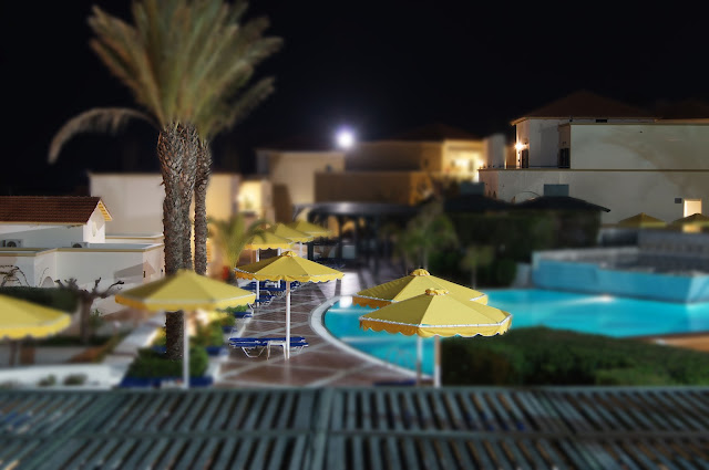
This is my final piece I have decided on this because it relates best to my recent work looking at miniature style photography and I think that it is the best example of what I have created in trying to make it look not real and that it is a model. I got this idea from browsing the internet when I came across some of Kriss Kros's photos on the internet. I was amazed at how unrealistic they look and i wanted to have as go myself at creating something that is real but looks so fake. In this photo I have left most of it blurred and then unblurred certain areas like the sunbed and umbrella which look like litlle props in a model village. I also unblurred a building to the left of the photo, and the trunks of the palm trees.

Evaluation

My first reaction to the encounters, experiences and meetings task was to go out and photograph meetings between two different things in landscape photography. For example the meeting of the sea with the horizon or the sea with the beach or the nclouds with the sky. But I soon found that this idea was not the best and was very repetative and boring in some circumstances.
I started of by researching different ideas and getting ideas and inspiration from other photographers work. I looked a bit at Bill Brandt's work, were he would have a landscape in the background and then a body part close up in the front of the image. Bill Brandts work in the 1900's on the east sussex coast was what I was specifically looking at. After getting an idea of his style of photography I went out and did a shoot were there were hands in the front of the picture pointing at something with the landscape of the sea in the background. Here is an example-
After looking ar Bill Brandts work and doing a shoot in poole I explored other photographers that take pictures in a similar style, one of these was Arno Rafael Minkkinen. Then I did a few shoots in the Ringwood and hightown area of landscapes. Also I did alot of editing of these photos, creating different effects with saturation and B&W.

Ideas for Final Piece

Final Piece ideas
This picture above is the image before I edited it in Photoshop. I used the high dynamic range tool to create this really cool effect. To do this you need many variations of the photo in different brightnesses and contrasts. Then once these have been murged together you can play with many different setting to create the effect that you want.
HDR final piece idea
 This is the original image of the rusty wheel in the forest before I added the HDR effect. I also cropped it so the picture was more about the wheel and less about the forest.

HDR final piece idea


Another example of model village idea, maybe final piece.  Has also had the HDR effect tool used on it.

Monday, 23 April 2012

Artist Research Kris Kros

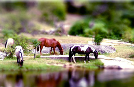
Kris Kros does many different styles of photography one of these styles is miniature photography were you make it look not real and like a model village.  Here are some examples of her work:
As you can see they are all very well composed, Kris says that the most important thing when doing this style of photography is light, the image or scene must have enough light on it to be believable as a model. If there are dark areas of too many shadows then it becomes less and less like a model. The one above of the horses ius a good example and as you can see there is alot of light and no dark areas. Actually if you look through all of these photos the one thing that they have in common is that they are all welll lit.
Here is one that I had a go at doing, I dont think that it came out very well though simply because there was not enough light. The foliage is just too dark and so is the sea.

Model Village Style

Here are some pictures from variouse artists that all look like models, but there not there real. I really like this style of photography as it almost plays tricks on the mind in wether it is real or fake.

 The one above is the actual photo and the one below is it after it has been edited. As you can see to create this effect they have made the colours more intense by probably upping the saturation, then they have blurred the photo in some areas to create depth. I really like this final photo and I didn't think that it was real when I first saw it.
This photo was taken in France and this photo really inspired me to look deeper into miniature style photography were it looks like a model village.

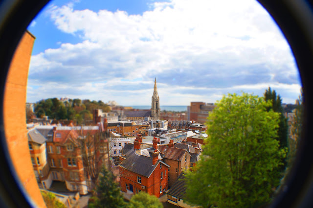
 Here are some of my attempts at model village photography. This is one that I took in bournemouth, I blurred it in a few places and upped the saturation to create this effect.
 This one I took through a fisheye lens and I think this adds to the miniature photography style and only makes it better.
This is the same photograph as my first attempt only I blurred it in different places.


 This is a sort of panoramic that i have tried to make into a model village style photo. I think that it is my best one yet, I really tried to create the depth of field by leaving objects both in the foreground and background blurred and then only having a select few buildings in the middlle of the photo in focus.This is a picture that I took in Greece when on holiday, I have tried to use the miniature style here and make it look like a model village. I have tried to create depth within the photo, by rubbing out the blurred layer to leave behind some in focus parts of the picture.
 
All three of these bottom images were taken in bournemouth by me aswell. 

Monday, 16 April 2012

Bournemouth town landscapes


I took these photos in the town of Bournemouth from the top of a car park. I have then edited them in photoshop by doing things like putting up the saturation to create this really vibrant and colourful photoraph. It has a really warm feel to it. I have tried to make it look like it is not real life, as if it is a model village. To do this I blurred the whole image and then erased it in certain areas to create this effect.


Here I have used a blur effect in some parts of the photo but not in others. This really draws your eyes to the parts which are in sharp focus. For example I have tried to make the church the main point of the photo, and that is were your eyes are drawn. I have also upped the saturation on this photo to give it the colourful and warm look to it. It really brings out the redness in the bricks.


This is a panoramic of bournemouth and the town and sea. Once again here I have upped the saturation to bring out the colours and make the photo overall alot brighter. The sea is also a very deep rich blue colour.

Pdf
View more documents from Petewall003.

Thursday, 22 March 2012

Three legged cross shoot 2

Three legged cross shoot 2

These are some woods that are in verwood, I have used a fisheye lens to exagerate the height of them and I think that it gives a really cool efect. I have then edited it into black and white on photoshop and put the brightness down to give a dark gloomy feel to the picture.

Three legged cross shoot 2 part 1
View more documents from Petewall003.


This photo or photo's as I have taken 4 shots here and stictched them all together in photoshop. I really like how everything is in focus, from the very close bushes right back to the trees in the distance.


With this photo I added some motion blur around the edges and I think it gives it a really cool effect. I also put it into black and white to give it that dark mysteriouse feel. The sun coming through the trees is another nice feature within the photo.

Three legged cross shoot 1

Three legged cross shoot 1

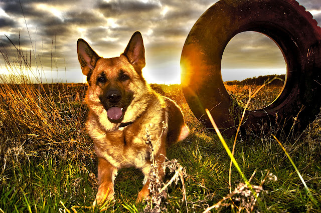
These are some photos of my dog, I really like the bright sunset in the background that brings out here golden fur.  Also the tyre is an interesting addition to the photo, it gives great depth of field.

These are some landscape shots of the sunset across the open ground, I especially like how heavy the clouds look and how they look like they are about to enclose the sun and push it beneath the horizon. It looks very dramatic and heavy. You also get the different depths within the photo by the tyre.

Here I was trying to get the reflection of the clouds in the water, and i think that it turned out ok.

Tuesday, 20 March 2012

Andres Gursky

Andreas Gursky
This is one of Andres Gursky photographys that he has edited. It is very serial, believe it or not there used to be a factory on the otherside of the river, but he photoshopped it out and it looks very empty and bleak now. I really like this.
andreas-gursky-rhein-ii
This is another one of his photos, it is of the bahrain race track. I really like this photo as there are so many different levels within it and you really cant tell the depth or height of different parts of the track. I really like the way this photo was taken, it was taken in a very clever way. It almost plays tricks on your mind. Obviously this is heavily photoshopped but this is what makes it look so crazy, I really like how he has done it.
andreas-gursky-bahrain-i-2005
As you can see from these two examples, his work is very repetative. This is what makes his work stand out, he heavily photoshops his photos to create this repetition, he uses the clone tool alot to take parts of a photo and repeat them in other areas of the photo.

Hightown Lake Shoot

These are some photos that I took at Hightown Lakes, this is one that I have edited on photoshop and I am very pleased with the outcome.


On this day the clouds were amazing and this was the main reason that we went out and did a shoot, when we got to the lake we found this old wooden bucket and to make it float we plugged the hole with a stick. We then floated it out onto the lake and snaped away. Then I put everything else into dark B&W and kept the bucket and stick in color. I am really pleased with the outcome.

Hightown shoot
View more documents from Petewall003.


This is a panoramic, I created this on photoshop when I stitched tohether about six photos that i took at hightown lake. I think that it came out really well, and i really like how everything is in perfect focus and is very crisp. I also like how it gives no depth of field.

Monday, 12 March 2012

Photos Related Back to Bill Brandts Work


I have edited this photo so that it is in the style of Bill Brandts work, I have used the hand as if it is sucking and pulling the color out of the photo. I am just trying out this idea here and it is by know means a perfect picture of edit, but I will keep putting bodyparts in the foreground of landscape's.


Here I have taken one of my edited photos of the church and then added part of one of Bill Bransdts iconic photos. I think that it works well with the graveyard setting.

Tuesday, 6 March 2012

Ringwood shoot

These are some photod that I took at the river in ringwood, I have also taken 3 photos and then stitched them together in photoshop.


This is a photo of the church in ringwood I have edited it into b&w. I took this photo with a fisheye lens. I really like this photo as it has a still and creepy look about it, it also looks like the color has been drained out of it.I used photoshop to put this image into B&W and I thnk that it has come out really nicely.


Pdf
View more documents from Petewall003.

This is a sort of mysteriouse sypia version of the church, I created this effect in photoshop by playing with variouse tools.


In this photo i have kept the sky in the original colour and just applied a bit of burning, and the rest of the photograph i have put into B&W, I think that it looks really strange. Almost like the rest of the world is alive and this church and graveyard is dead, whit the life sucked out of it.
I took this photo one evening of the fields and trees from my window. I then used the same photo from the same spot that I had taken in the daytime at a later date, I then stitched these together on photoshop. I think that it gives a really cool effect as the sky is vibrant with the clear windswept clouds and the bottom fields and trees are still and dark and gloomy.